Color can affect our mood and state of mind, so it’s important to choose paint shades that cultivate positive emotions when decorating your home. 2023 has seen a rise in warm, neutral, natural hues such as soft yellows and oranges, mushroom beige, earthy browns, and muted greens. These shades can instill a sense of calm and relaxation, but that doesn’t mean you should shy away from bolder colors if they elicit happiness in you.
Let’s take a look at five colors that spark joy to help you inject some feel-good atmosphere into your home.
Yellow
Yellow tends to be the first color that comes to mind when we think of happiness. After all, the sun is yellow and we always feel uplifted and joyful on sunny days.
Plus, the rising of the sun symbolizes renewal and, therefore, optimism. Vivid shades like lemon and canary yellow feel very energizing, but they can overwhelm small spaces.
Whereas warm, orange-toned yellows like sunflower and marigold have a cozier feel. Similarly, rich tones of mustard and saffron have a decadent look, while pastel hues of butter and lemon chiffon can help dark spaces feel brighter and more welcoming.
Orange
We tend to associate the bold colour red with energy and passion, and orange gives off a similarly vibrant vibe with less risk of being overpowering. It’s a cheerful, striking colour that has the benefit of making a space feel warm and inviting. Bright tangerine orange is a great choice when you want a space to invigorate and energise you. Or opt for coral for a zingy and refreshing feel, an excellent choice for a bright feature wall in a living room. In contrast, softer shades like apricot and amber have a gentler impact for a soothing atmosphere
Pink

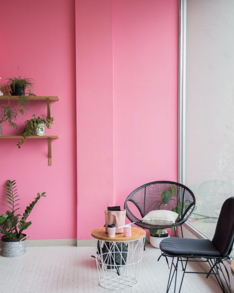
Photo by Stefen Tan on Unsplash
The color pink symbolizes themes of love, romance and sweetness, especially in soft hues of rose and sherbet.
Bolder shades of pink, like flamingo and bubblegum, can brighten a space up and create a sense of hopefulness and playfulness. The brightest pinks, like hot pink, magenta, and fuchsia, can evoke feelings of strength and empowerment since they are not too far removed from red.
Pink – although often associated with femininity – can serve as a neutral tone to warm up spaces without making them feel girly. For example, consider pairing pale blush walls with contemporary black furniture to create some striking contrast.
Blue
According to a survey by YouGov, blue is the world’s favorite color – what better way to spark joy in your home than to paint it your favorite shade?
Blue is the colour of the sky, the ocean, and bodies of water which is why it tends to be associated with calm and serenity. It’s ideal for use in rooms where you want to relax and unwind.
However, be cautious of using cool-toned blues as these can make a room seem cold and uninviting, particularly in areas that get little natural light.
Joyful and inspiring shades of blue include cobalt, sky blue, turquoise, and royal blue.
Green

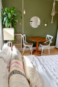
Photo by Andrea Davis on Unsplash
We see the color green in nature all the time, so it’s strongly associated with the tranquillity of the great outdoors.
Green invokes a sense of calm, but it also represents growth, renewal, and health. It can inspire change and help us to feel motivated. This makes it a great color for use in home offices or any space where you want to harness productivity and focus.
Dark shades like forest green, bottle green, emerald, and pine can exude a sense of luxury and indulgence. Whereas brighter shades like pistachio, jade, mint, and pear feel fresh and optimistic.
Choose a color that represents your happiness
Colour theory and symbolism can help guide us when choosing paint for our home, but nothing compares to gut instinct.
Perhaps the colour that makes you happiest is simply the one that’s your favourite. Maybe it’s a colour that you associate with a joyful memory, or with a person that makes you feel happy. Pay attention to the colours around you and take note of how they make you feel. Use this to guide your home renovation choices and paint your way to happiness.


